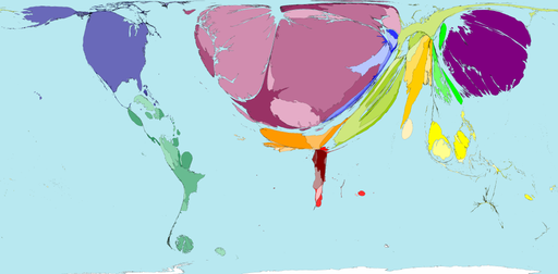
Cartograms are maps where the sizes of territories (countries, say) are proportional not to the surface area of their real-world counterparts, but rather to the value of some other attribute, like population or GDP or incidence of malaria. You can see lots of really wonderful examples on the Worldmapper website. That includes a few agricultural variables and some forestry stuff. Here’s an example of the former, net imports of vegetables by $ value.
As I said earlier in connection with Gapminder, wouldn’t it be great to be able to produce cartograms from FAOSTAT data? Or what about from the data in SINGER? Well actually that shouldn’t be all that difficult, the code for making your own cartograms is available, according to Worldmapper’s FAQ. Any volunteers?
Cartogram © Copyright 2006 SASI Group (University of Sheffield) and Mark Newman (University of Michigan), reproduced by permission. Worldmapper is at: www.worldmapper.org
I created a cartogram of land grabs, you may find it interesting:
http://www.petergiovannini.com/Landgrabbing/index.html
best,
Peter