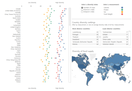
You may remember the paper Increasing homogeneity in global food supplies and the implications for food security, which we blogged about a couple of times when it first came out in 2014. National Geographic did a pretty good job of visualizing some of the data online, but CIAT have blown them out of the water now with a fabulous interactive website.
You can listen to Colin Khoury, the brains behind the whole thing, on Jeremy’s latest Eat This Podcast. And you can read about the most surprising results on CIAT’s blog. Spoiler alert:
1. Almost everybody eats a lot more food than their grandparents did. And it’s more diverse.
2. African, Asian, and small island countries have the world’s most diverse food supplies. Also the least.
3. Crop immigrants are the key to dietary diversity.
4. The world’s average diet means eating like people do in Cape Verde, Colombia, and Peru.
5. Political unrest can lead to greater diversity in people’s diets, or less.
There’s also a companion piece by Colin on the Global Plant Council website. And this is what Colin says on his Facebook page:
We built a big data website! When we published our findings of increasing homogeneity in global food supplies, we hadn’t yet found a good way to make the underlying national-level data readily visible to interested readers. This is why I’m tremendously excited to announce the publication of our new Changing Global Diet website, which provides interactive visuals for 152 countries over 50 years of change. We that hope you will enjoy your own investigations of dietary change over time. Perhaps you can tell us where you think the changing global diet is headed.
If you do play around with the website, you can share any interesting stuff you find using the hashtag #changingglobaldiet on Twitter. Me, I’m going to have a bandeja paisa and feel like a proud citizen of nowhere.
One Reply to “Exploring global diets”